Improve team experience working on Techcombank Design System
Role
Design System Lead
Company
Techcombank
Hanoi 2022
✱
In less than 4 months, our Techcombank Product Design Team (PXD) had built from scratch and launched the MVP of our first organisation design system, which fostered real-time collaboration among 5 multi-disciplinary product teams on a daily basis. This is about the post MVP where we relentlessly optimize the system in order to spend time thinking about high level UX problems instead of mindlessly repeating busy work.
Background
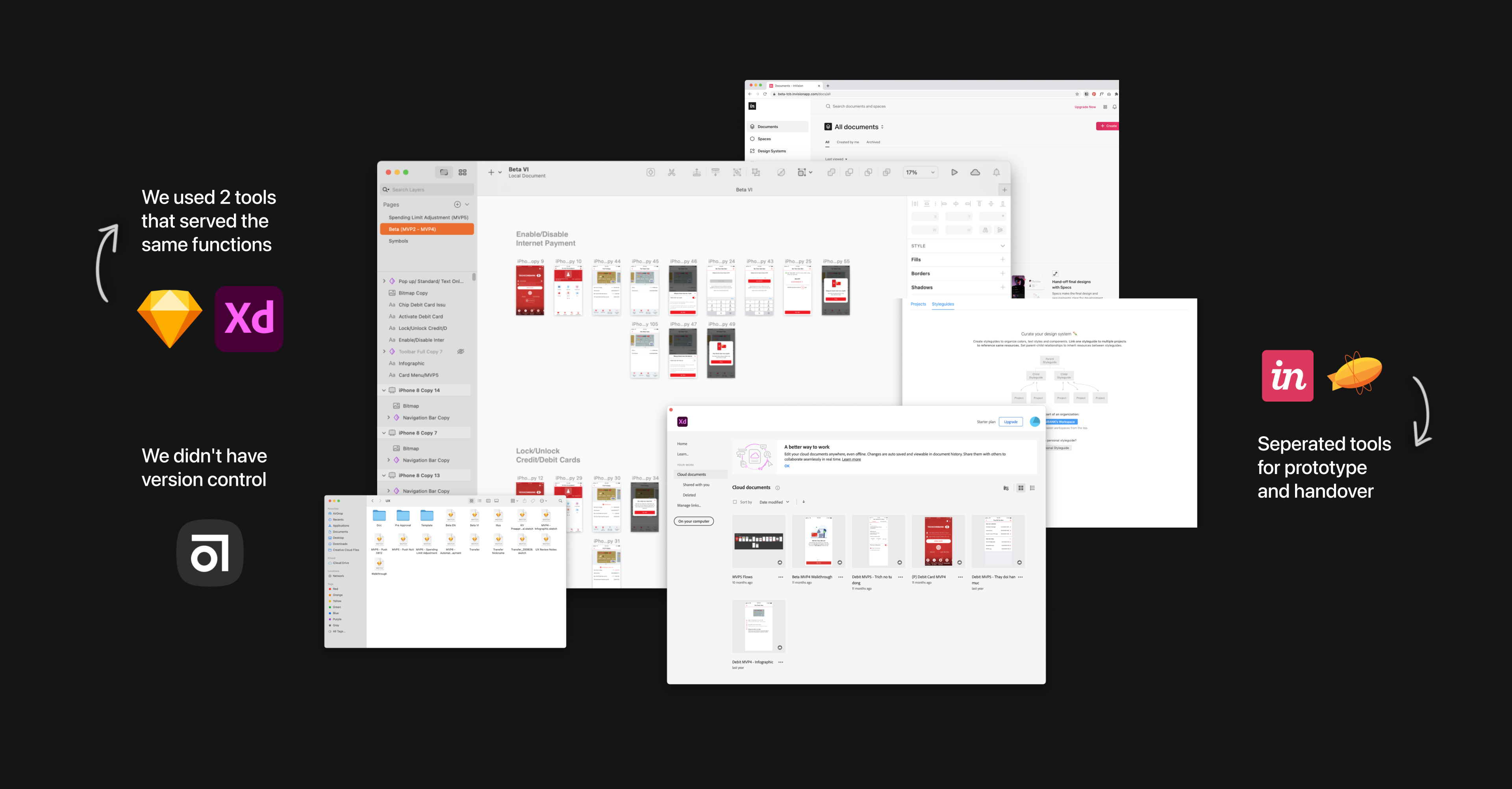
Before 2021, there was no design system in Techcombank. From the very first ideation to production, designers had to switch between 4 tools for wireframes, design, prototyping, and handover. There was no such thing as version control and real-time collaboration, which resulted in high effort, low consistency, and poor user experience.
![]()
Starting of 2021, along with the redesign of our omnichannel experience for both retail and corporate sectors, we migrated all assets from Sketch to Figma and initiated the organization's first family of design systems, which successfully engaged with 9 product teams across 3 platforms (mobile app, web app, website).
Sounds like a happy ending? Well, we’re not there yet…
Before 2021, there was no design system in Techcombank. From the very first ideation to production, designers had to switch between 4 tools for wireframes, design, prototyping, and handover. There was no such thing as version control and real-time collaboration, which resulted in high effort, low consistency, and poor user experience.
Starting of 2021, along with the redesign of our omnichannel experience for both retail and corporate sectors, we migrated all assets from Sketch to Figma and initiated the organization's first family of design systems, which successfully engaged with 9 product teams across 3 platforms (mobile app, web app, website).
Sounds like a happy ending? Well, we’re not there yet…
The status-quo
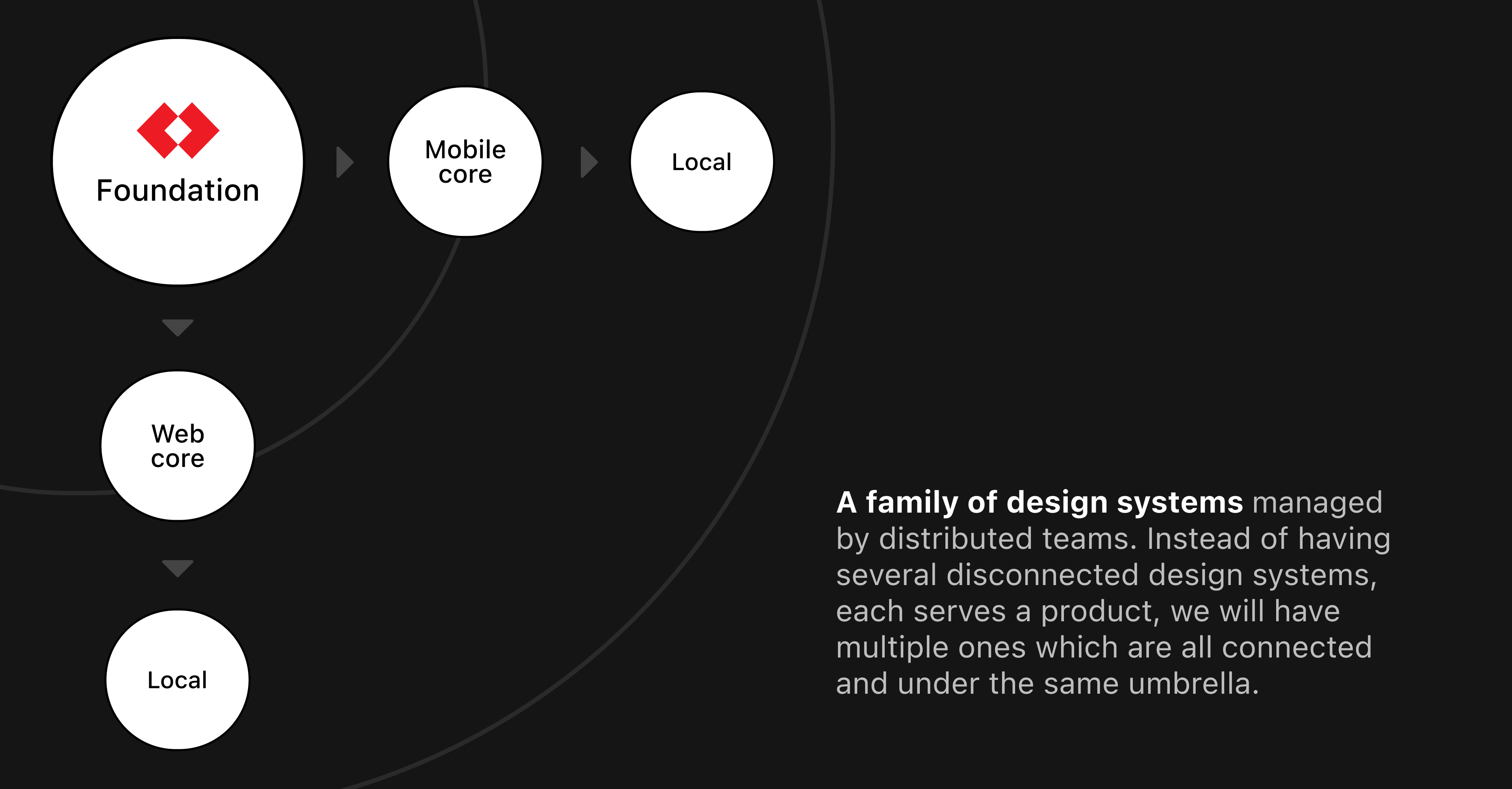 The underlying structure of Techcombank Design System family
Our design system was not just a single style guide. It’s actually a family of design systems, managed by distributed teams, each including design and documentation. The idea was to de-centralise the building and maintenance of each system to the product team so that it serves the particular experience, service, and business model.
However, we faced several problems after teams defined the experience journeys and started to build prototypes. Designing at scale, across multiple products, projects and scrum teams turned the design system into a messy workspace with several conflicting components and indistinct patterns. We heard complaints from time to time, like:
😩️ “It takes so much time to find the thing I need! Where is your file in again?”
😰️ “Hmm, I am not confident that this component is ready to use.”
In the long run, this might end up in poor quality customer experiences, brand dilution, and production inefficiency including slow time to market, lost assets, and of course, sad and burnt-out designers.
Finding the root causes
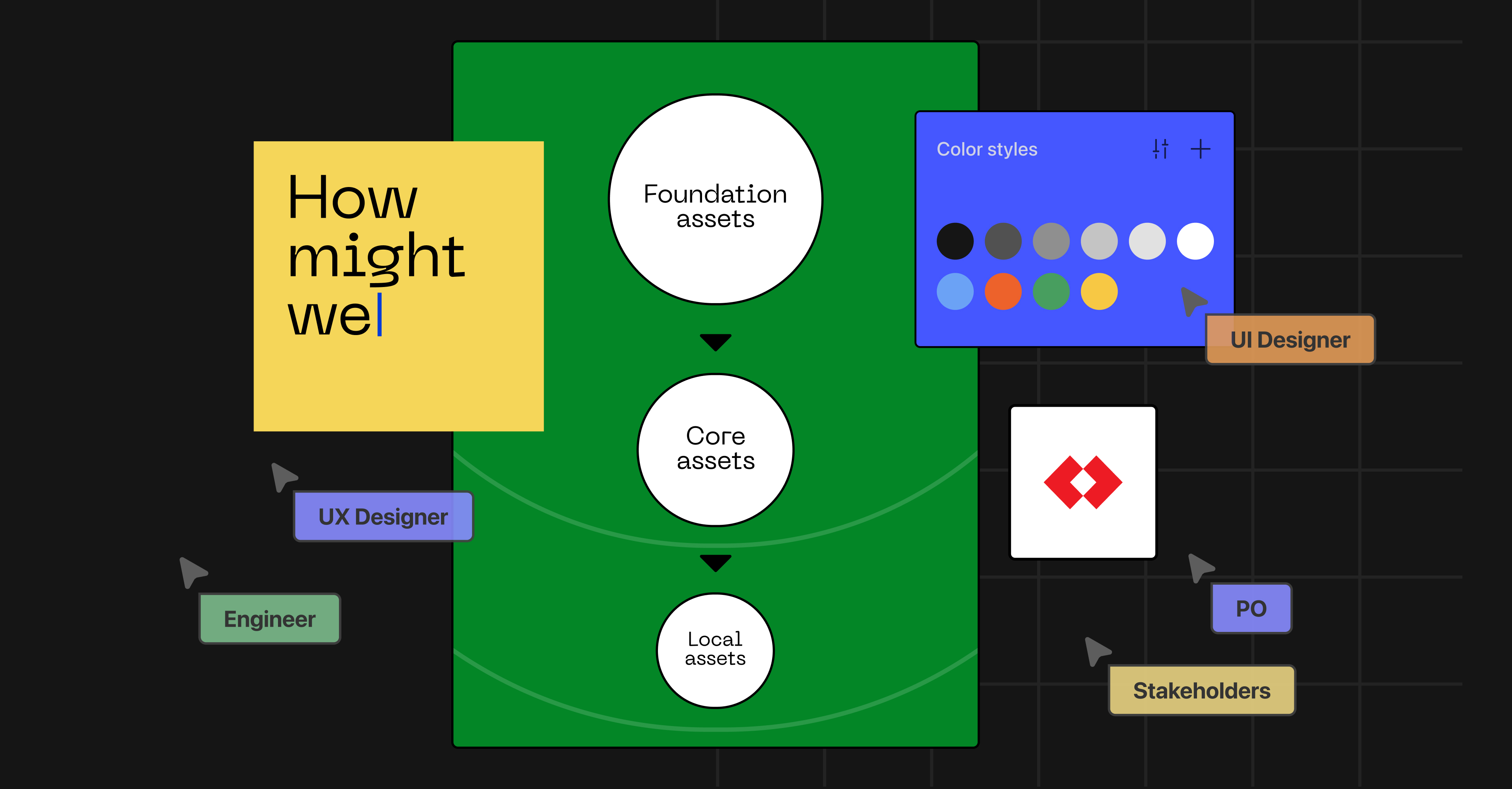
A bunch of designers assembled to conquer the issues, with the goal of better-structured and highly discoverable design system assets, including projects, design files, templates, patterns, and components.
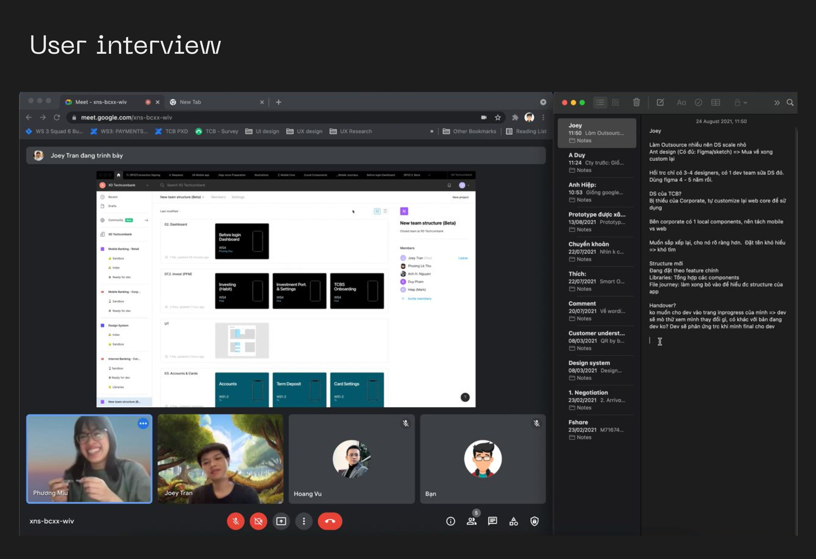
First step: reality check. We listed our hypothesis behind a messy, inconsistent design system, what we thought we know, or what we didn’t know at all. The best way we could find the answers was to talk to our primary users. We sat with 10 designers, copywriters and developers in order to know their stories, their current behaviors and pain points working on the design system.
The research covered 7 themes: Seniority and experience, Tool literacy, Design system understanding, Daily workflow, Confidence, Worry & Fear, Closing the gap.
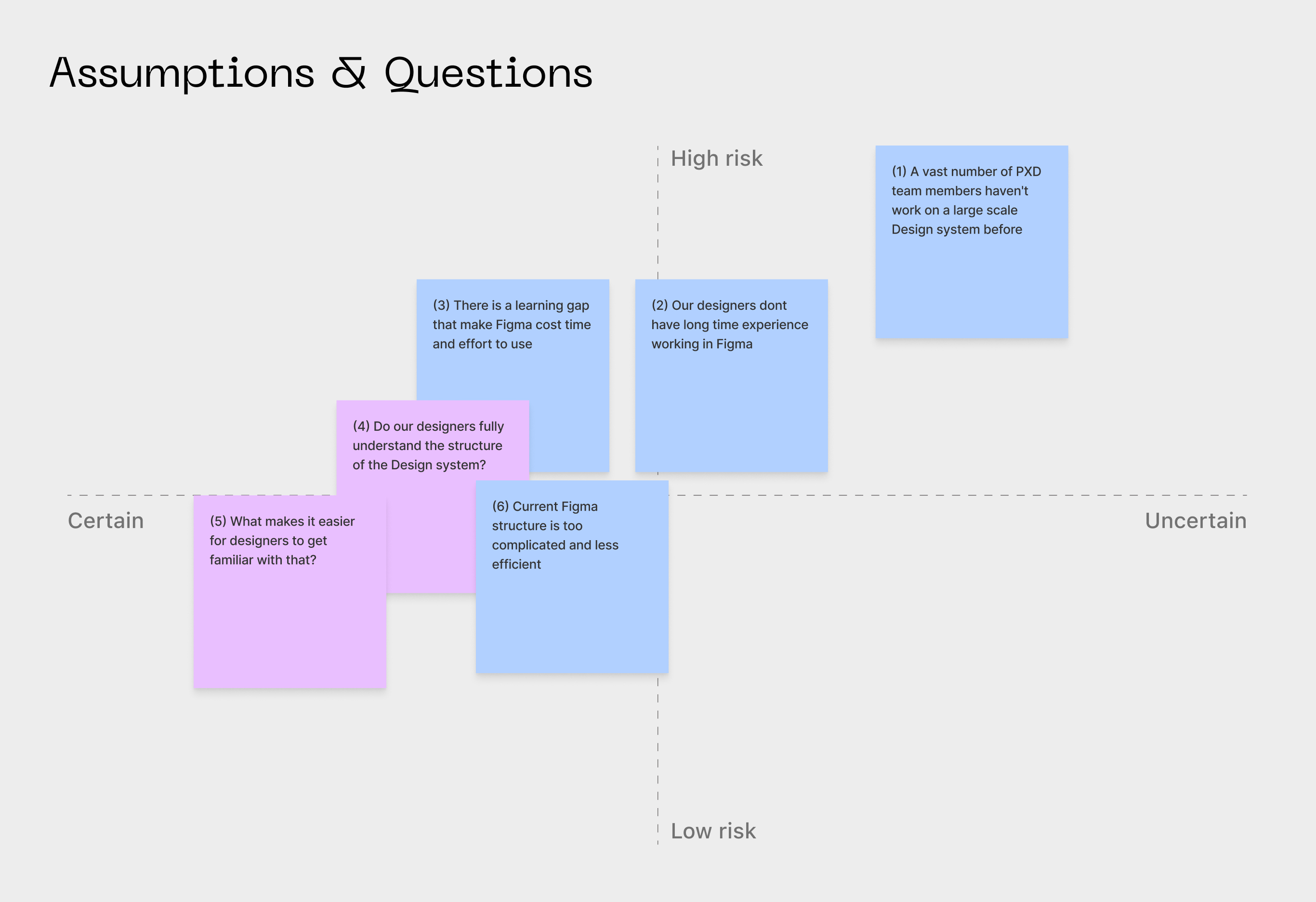
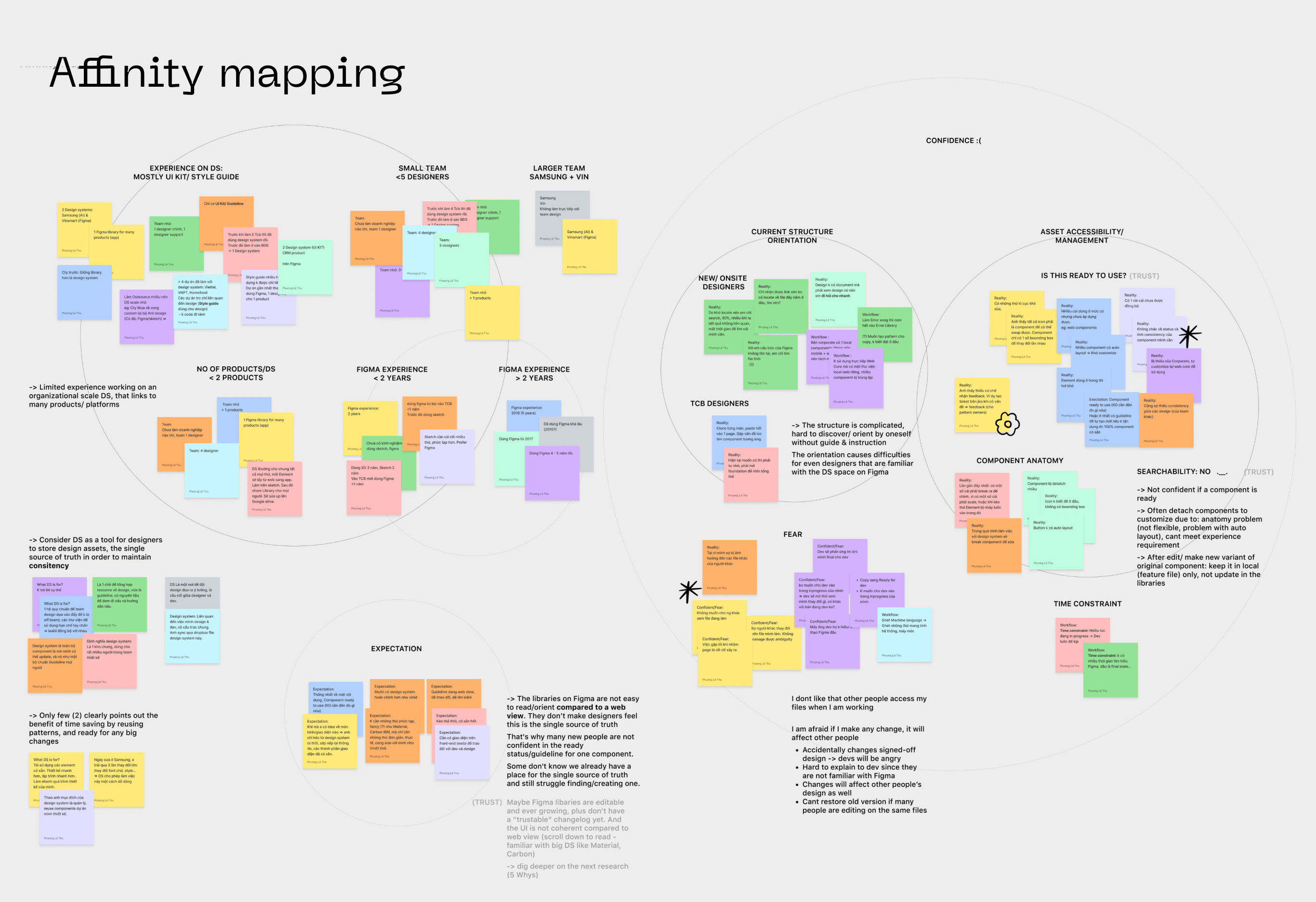
Here were what we found out:
- The current design system file and library structure (on Figma) is complicated, hard to discover, and oriented without guidelines or direct instructions. Even once the designers got familiar with it, they found it hard and take time to navigate.
- People have limited experience working on an organisational scale design system that links to several products across platforms. In addition to that, there was a gap in tool literacy.
- The assets (templates, patterns, and components) discoverability was low due to poor naming convention.
- The lack of guidelines and instructions resulted in poor design decision-making and time-consuming.
Solutions
We brainstormed several solutions to the root causes, and selected some to implement using prioritization mapping, taking into consideration our biggest technical constraint, which is the way Figma structures teams, projects, and files.
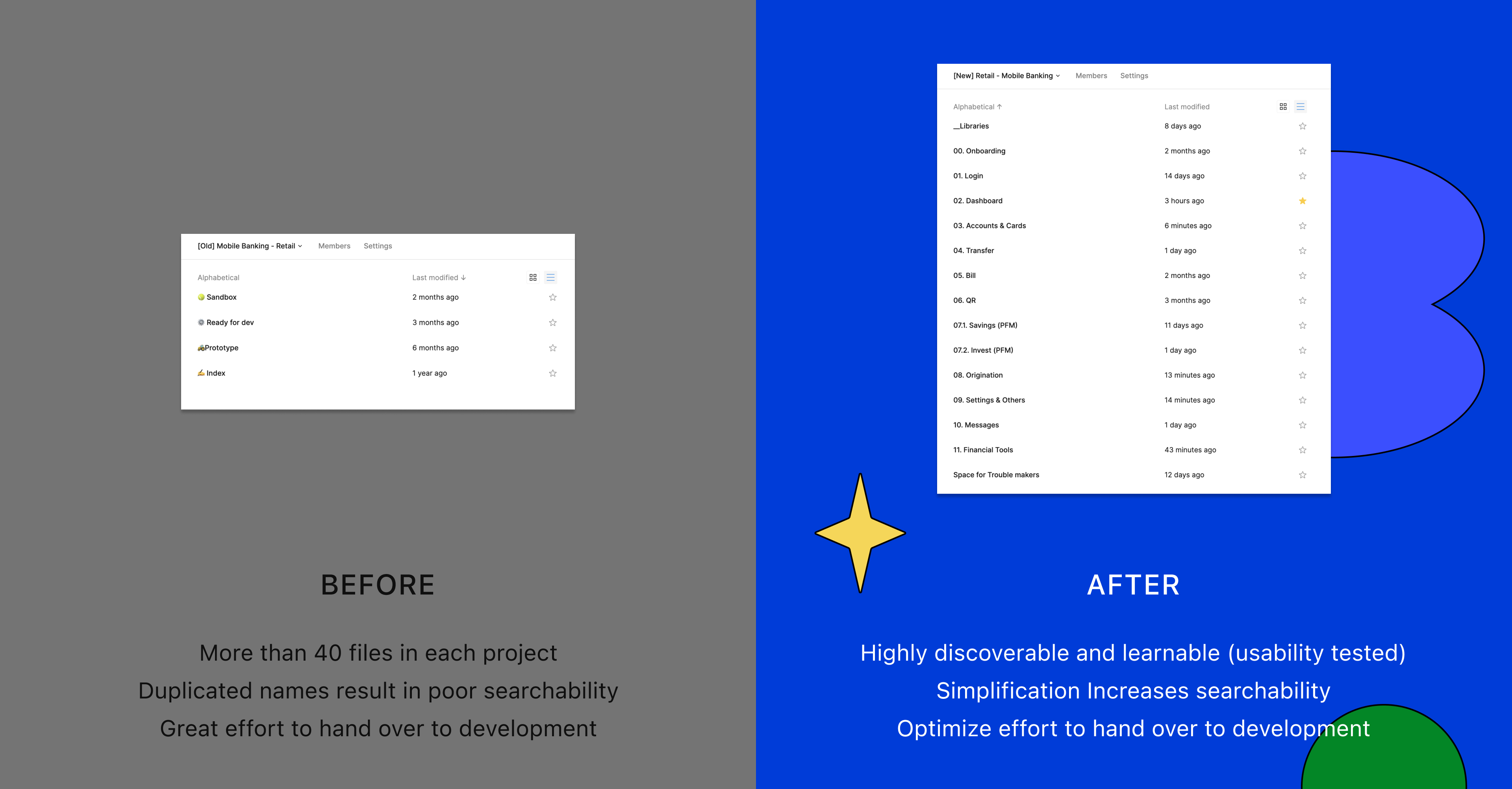
📂 Rearrange the Team Structure on Figma
People usually search by feature or journey name and tend to work on a single file instead of moving designs between Sandbox and Ready-for-dev space. Therefore, grouping similar features and journeys into a theme enhances searchability. The work progress is also more simple and transparent, when scrum team members, from designers, POs, BAs, engineers, and QAs all access in 1 file.
In fact, we tested this new structure with 10 users before rolling it out to all the team, and the discoverability and learnability were significantly increased. A user like our new UX copywriter could navigate in our system smoothly in no time.
🗓 PXD Saturday Workshop
Our PXD team hosts a workshop biweekly for all team members to discuss the design system way of working, introduce new patterns or UI components and their guidelines, and share with each other the pro tips and cool plugins.
All the impediments, constraints, or feedback are considered so that as a team we keep iterating.

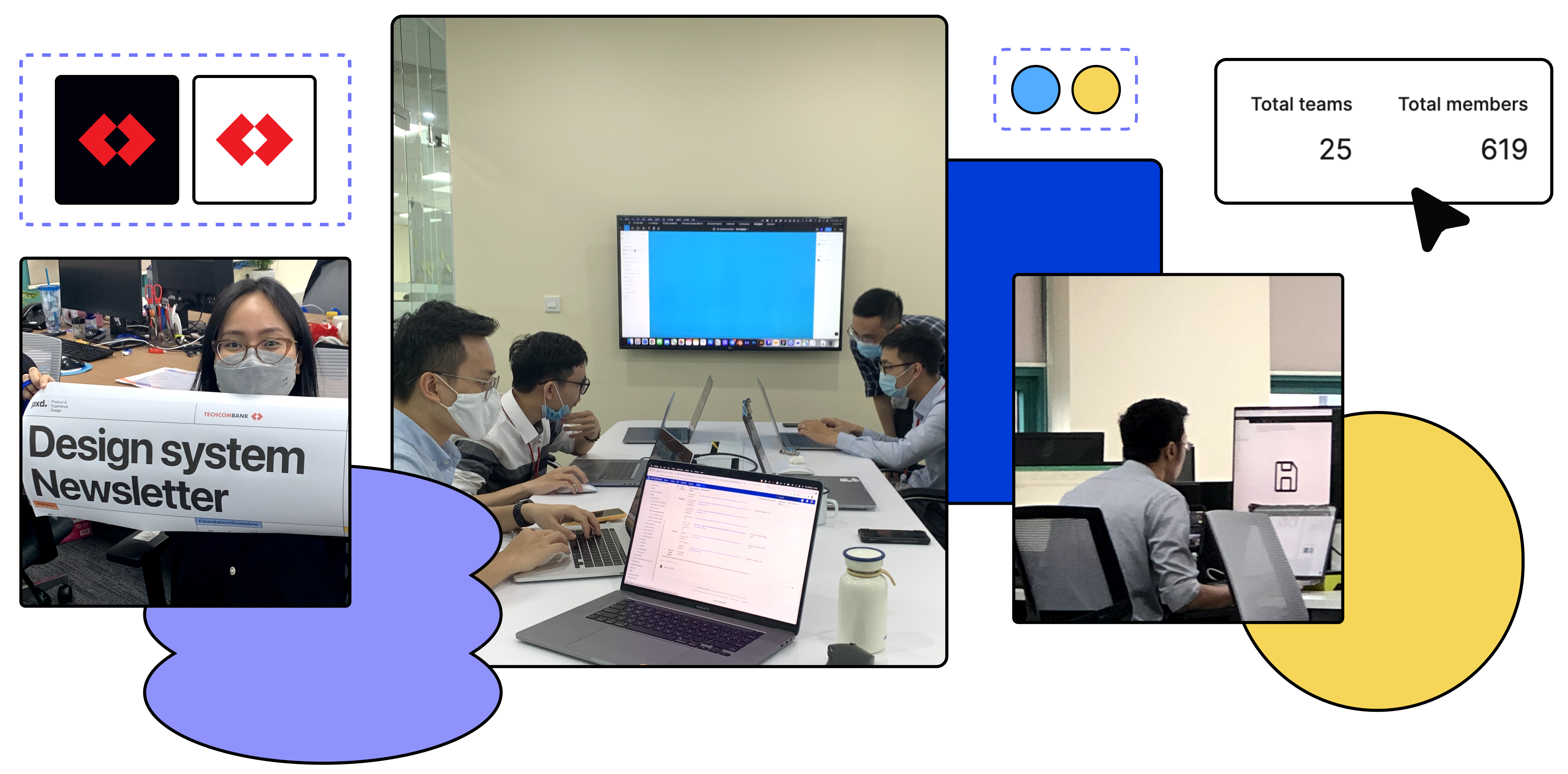
📰 Design System Newsletter
Since our system is more about human experience than just only technical specs, we acknowledge that the time we invest in relationships with designers and engineers, business teams, and stakeholders is as important as building the system itself. That’s why we start sending out the Design System Newsletter fortnightly. That’s why the goals for our Newsletter go beyond our archive of work and UI spec that only some designers care about.
With each issue of the Newsletter, we want to:
- Make sure our work is transparent
- Guide people about the system and how they can contribute to it to make it useful for the rest of the organisation
- Create a common language for our system
- Show how we tackled customer experience with our system so that people can see the scale and breadth of our work
We often have this joke that the design system is never done. Publishing the Newsletter is a nice thing since we start to feel accomplished and gain motivation to move forward.

Enjoying our self-actualising moment of getting things done.
Results
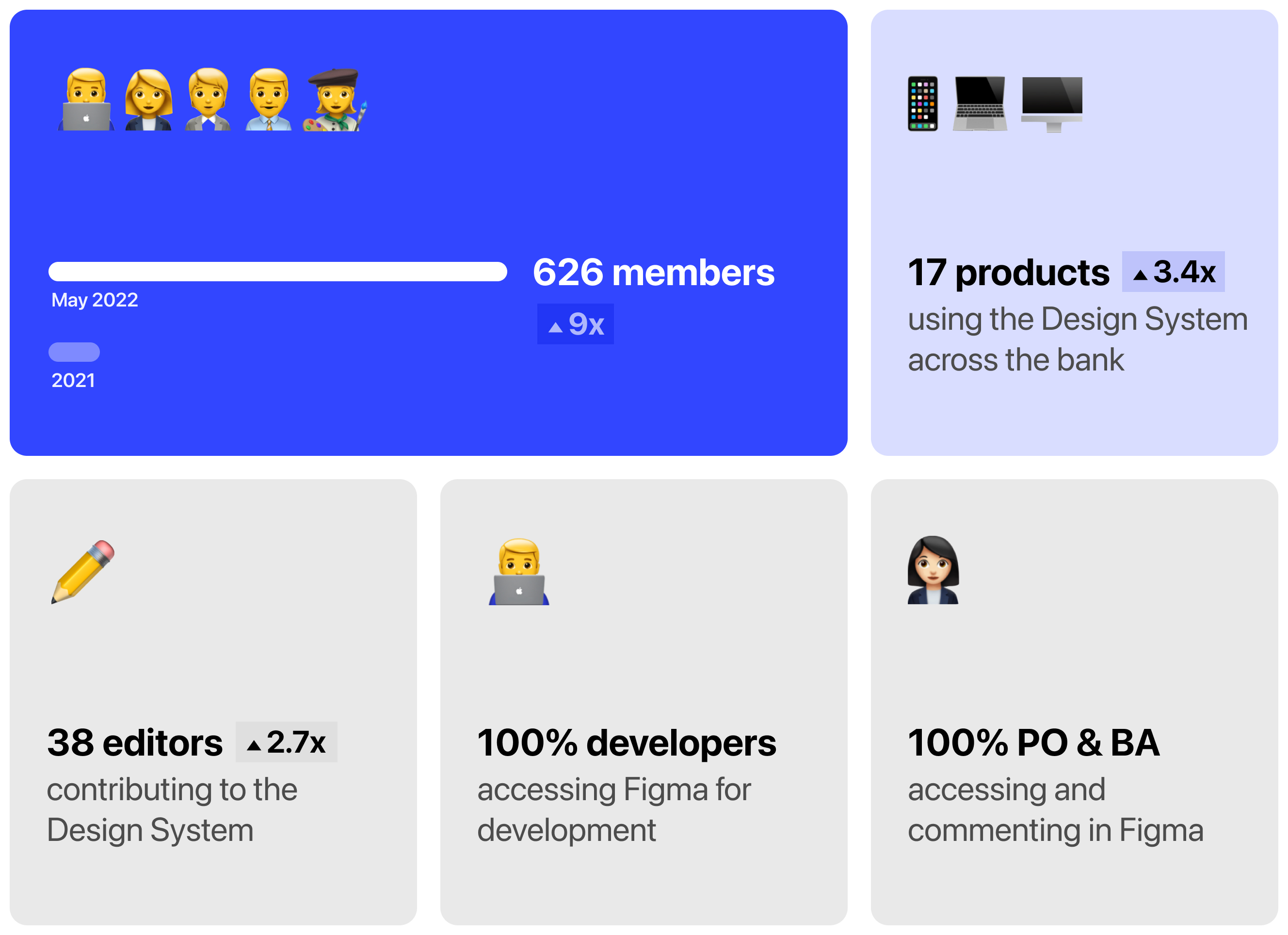
We have witnessed a significant increase in the number of members using the system for their daily work since our very first enhancement. 100% of members from 17 multi-disciplinary product teams access Figma for design, feedback, development and testing. Aside from the Digital Office, we also welcome members from other departments like Marketing, Digital Sales, etc., for design assets and real-time collaboration.
Things to improve
- Naming convention: The discoverability is one of our design system’s key success, and we know it can be improved starting with a clear taxonomy of naming convention. We try to avoid using long technical jargon to name our patterns or components, but to highlight their functions instead, so they match with the mental model of our designers.
- Design for experience: As the system scales, we have more and more defined components that combine into templates. The series of templates and screens make a customer experience. By refining those, we can boost consistency and save the effort of our designers in decision-making. At the end of the day, what designers want is to build prototypes and have them tested with customers as soon as possible, not trying to figure out how to use colors on a screen by reading 5-page length guidelines.
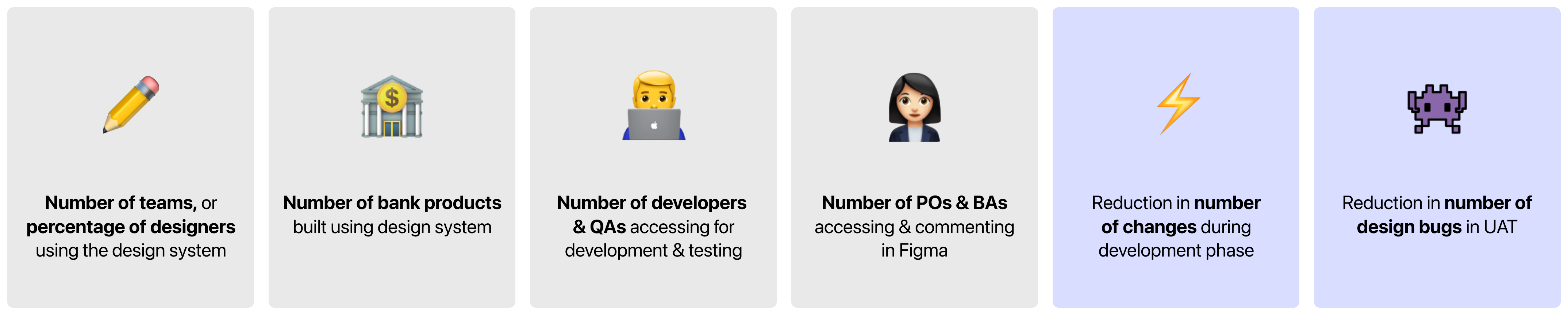
- Success metrics: The more we enhance our design system, the less effort people will spend on the development phase. In the near future, we will add a set of metrics to measure the effort saved, for example, the reduction in the number of changes and design bugs.
Conclusion
Design is thinking made visual. Techcombank Design System is where we systemize our thinking and decisions with visual language in order to optimize the team's effort and deliver the best experience to our users.
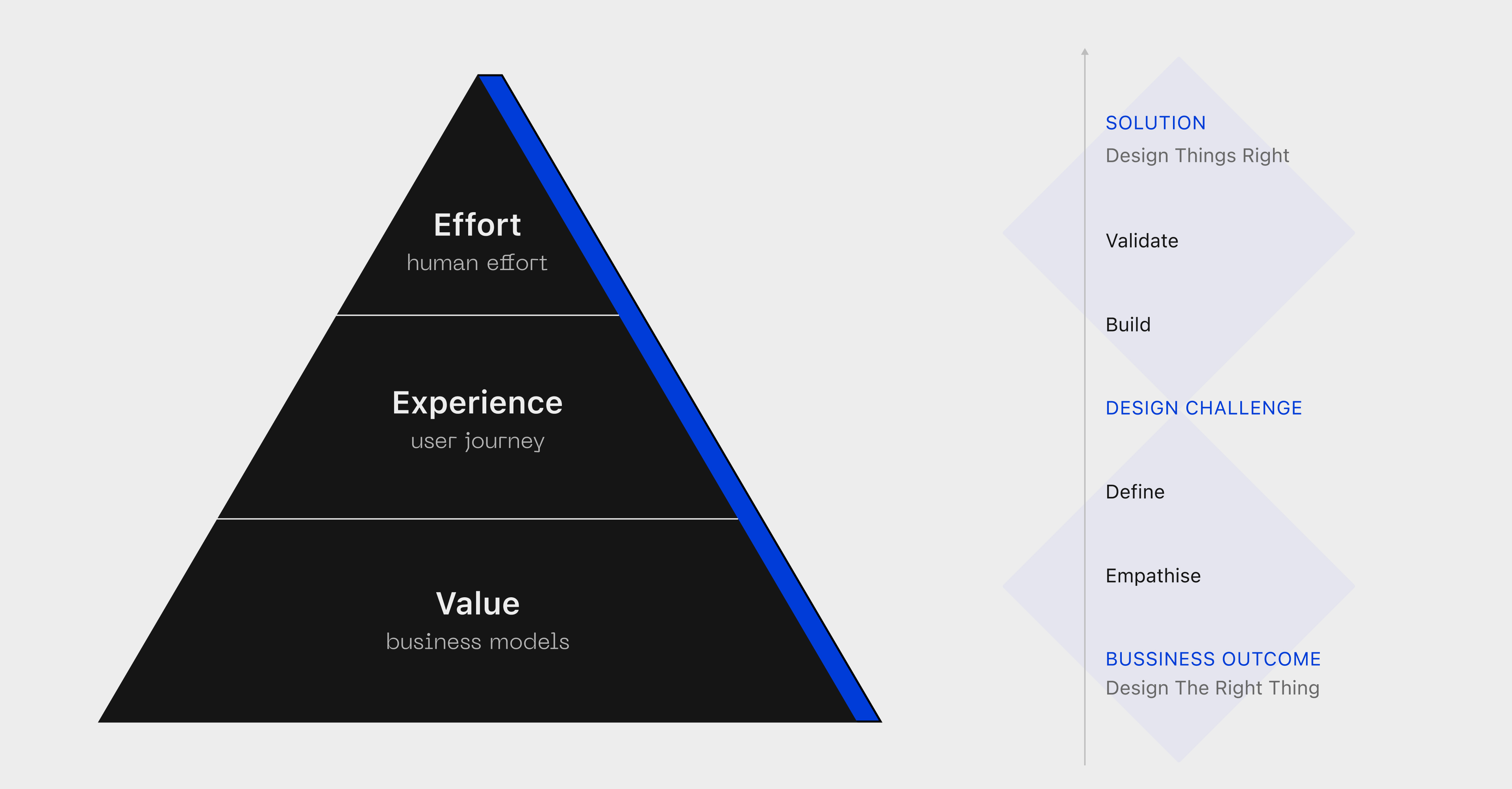 Experience hierarchy in terms of Techcombank Design System: From business model and outcome to user experience, and finally human effort optimization.
Though there are no dedicated product owners and designers, with that vision in mind, our team constantly strives to enhance the design system. After each improvement, we successfully deliver our solutions faster, be more transparent to non-design roles, get buy-in from our stakeholders and increase the number of happy designers across the universe.